2. Rediscovering Me pt.2
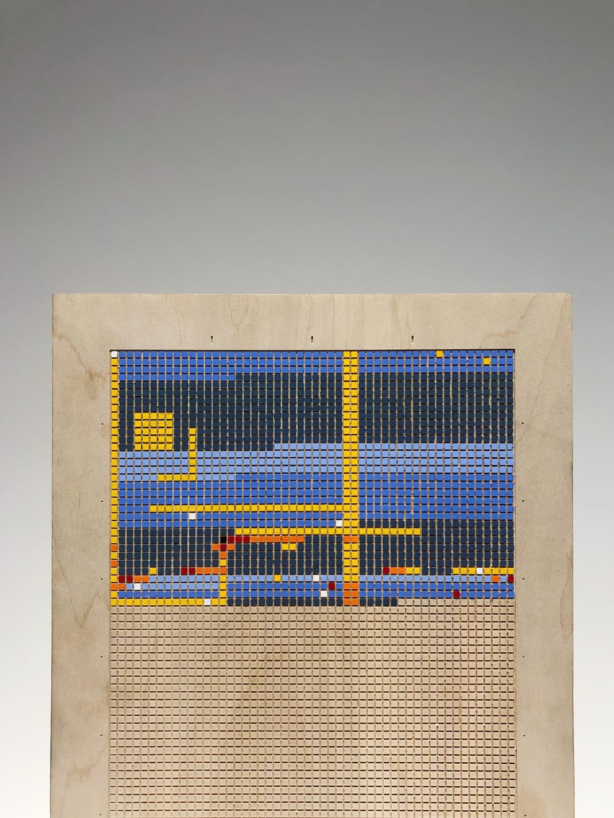
The story of Cartograph: a visual life calendar for mapping the heart, reconnecting with friends and family, and reminding me of the beauty and brevity of life.
This is the second post of a multi-post series. To better understand the contents of this section, I recommend reading part 1 first.
The Process
Creativity can be fickle. Sometimes ideas and concepts bubble out of me organically. At other times, I spin my wheels for months, iterating endlessly in a loop of perfectionism and self-doubt. The shift between these states occurs when I become overly focused on a project's outcome (clicks, likes, sales, etc.) instead of the creative process itself. I learned about this delicate balance during my time at Breathe99. It's a tension I'm still working to understand.
When I started thinking about Cartograph a year ago, I thought it would immediately jettison me from my creative and emotional rut. I thought a personal project of this nature would be small and approachable. The reality proved otherwise. The development of Cartograph has mimicked life, with various twists, turns, and re-traced steps.
I'm excited to share this process openly because, as designers, we often fool ourselves into thinking our method is relatively straightforward and repeatable: Double-diamond, human-centered, convergent and divergent thinking, and all that other bullshit. The reality is much more interesting and messy. Let's begin.
Phase 0: Project Seeds (~6/22 - 10/22)
I started going to therapy in late 2019. My then four-year relationship with my ex was turbulent and stressful (for both of us), and my first Kickstarter for Breathe99 had recently failed to meet its funding goal. I was struggling to cope. Something felt off with me, but I didn't know what it was, why it was happening, or how to fix it. With help from my moms, I found a therapist I liked. I've been going ever since.
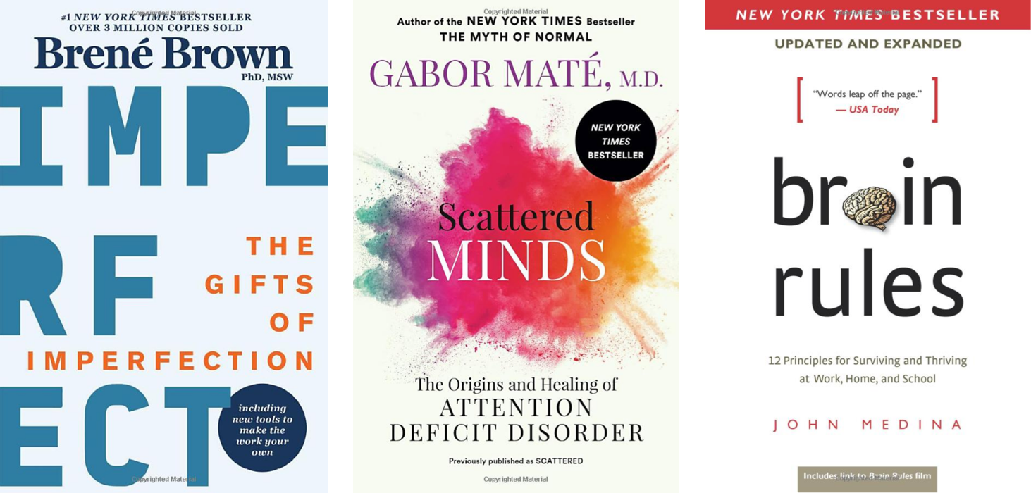
I've supplemented my talk therapy by reading Brene Brown, Gabor Mate, John Medina, and others. These doctor-authors helped shape my understanding of behavioral psychology, neurobiology, and childhood development. Their books also gave me a sense of belonging. Suddenly I had language to describe some of the more messy aspects of being a human. During this time, I also stumbled upon Ryan Holiday's Daily Stoic blog, where I was first introduced to the concept of a life calendar.
One of Ryan's favorite topics is Momento Mori: the stoic practice of meditating on one's mortality. It may sound macabre, but it's a thousand-year-old idea technique for achieving presence and focus. If you don't treat your time as precious, how can you be expected to use it thoughtfully? Or so the thinking goes. To illustrate this point, Ryan created a poster showing the number of weeks in an average lifetime. And after I started thinking about creating my own calendar, I found several other life calendars online.
Using a visual life calendar to promote self-reflection and purposeful grounding interested me; however, I didn't feel any available calendars captured this practice's magnitude and beauty. After reading James Clear's Atomic Habits, I wanted to leverage the concept of environmental queuing - the idea of designing space to foster a desired behavior - to create something more engaging and interactive for supporting my self-reflection practice.
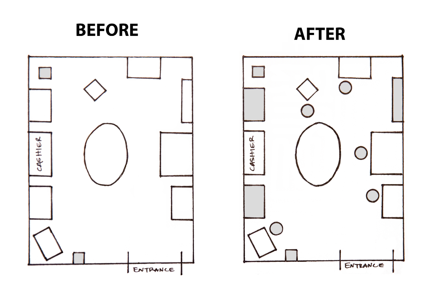
Left: The "Habit Loop." The four stages of habit are best described as a feedback loop. They form an endless cycle that continually scans the environment, predicting what will happen next, trying out different responses, and learning from the results. Right: Designers can use the psychology of the habit loop to create spaces and objects to promote desired behaviors. One example might be getting students to drink water (desired action) by placing more locations for selecting water in a cafeteria (environmental queues).
As a human-centered designer - a person who puts the end user at the center of the development process - many of James' principles of habit-building sounded familiar to me. I believed that for Cartograph to remain meaningful throughout a lifetime, it needed to be beautiful (an obvious cue), fun and effortless to use (attractive and easy), and rewarding to create over time (satisfying). These central tenants seeded my initial ideas for bringing my calendar to life.
Phase 1: Initial Design Exploration & Prototyping (10/22-1/23)
From the beginning, I wanted Cartograph to be intimate, handmade, and built to last. So, I discarded the requirements of using scalable manufacturing techniques or cheap materials. Unlike Breathe, I was creating something for myself. If others liked Cartograph, that was great, but it wasn't the point.
My initial concept was to use paint to fill the weekly grid, which I would carve onto a piece of wood using a laser cutter. A laser cutter might sound a little intimidating, but they work just like inkjet printers: send the machine a file, and it lays down a 2D image, except with a high-powered laser instead of ink droplets. The effect is a precise, two-toned image etched directly into whatever material you use. I already had a fair amount of experience with laser cutters, and I got started quickly by testing different speeds and powers for the laser.
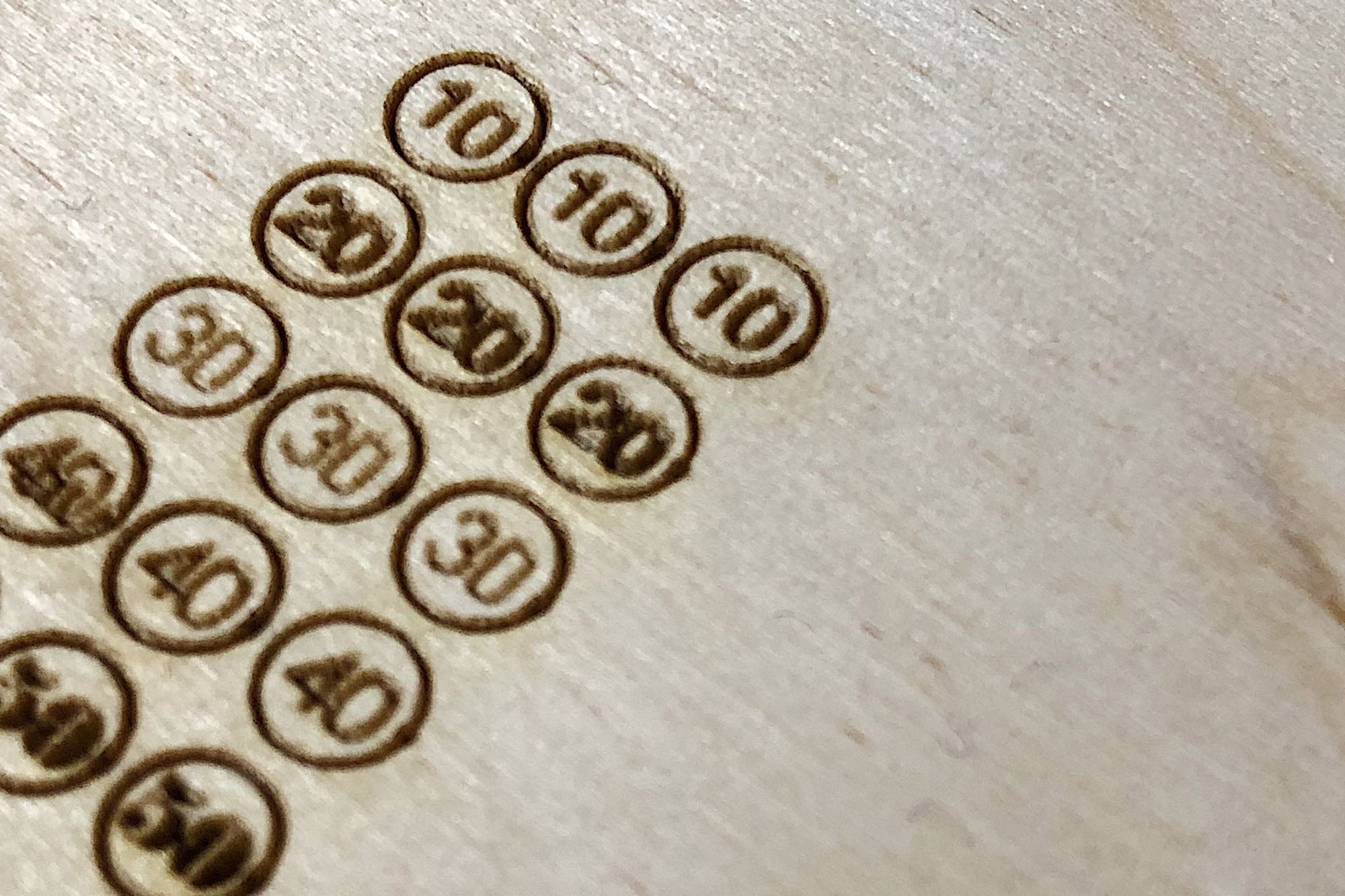
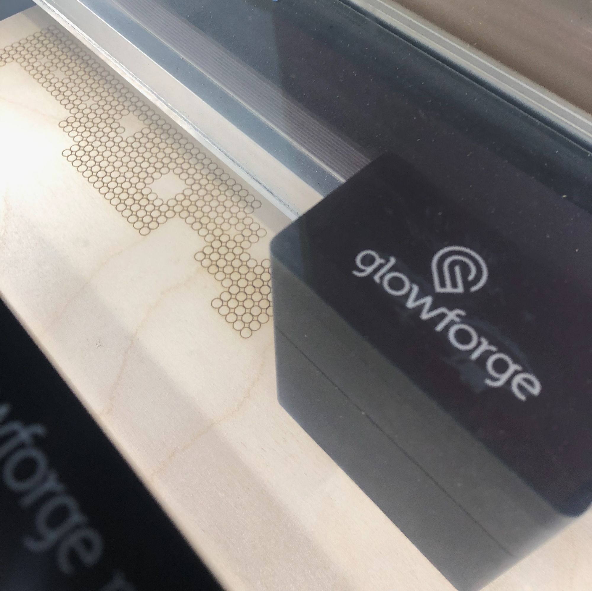
Test cuts at various speeds and powers using the GlowForge laser cutter
Despite my experience, I struggled from the outset. For some reason, the cutters I was using - the Glowforge Pro and the 60W ULS system - couldn't reproduce the perfectly aligned matrix of bubbles I created using Adobe Illustrator. The machines would snake around in a winding pattern, etching bubbles into the wood surface until the last minutes of the print job, when it would shift the remaining bubbles off by 1/4".
The GlowForge etching Cartograph's weekly bubbles in a winding pattern
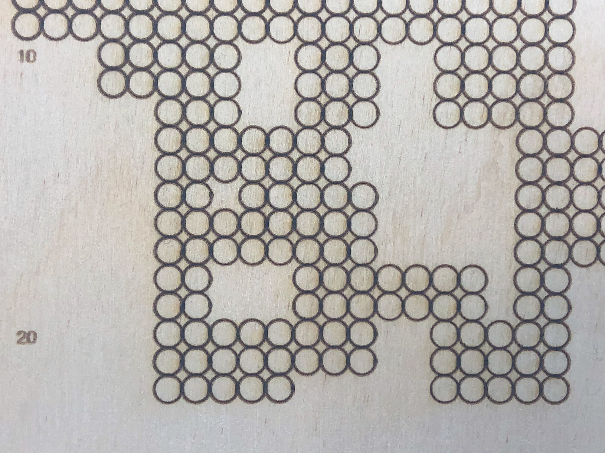
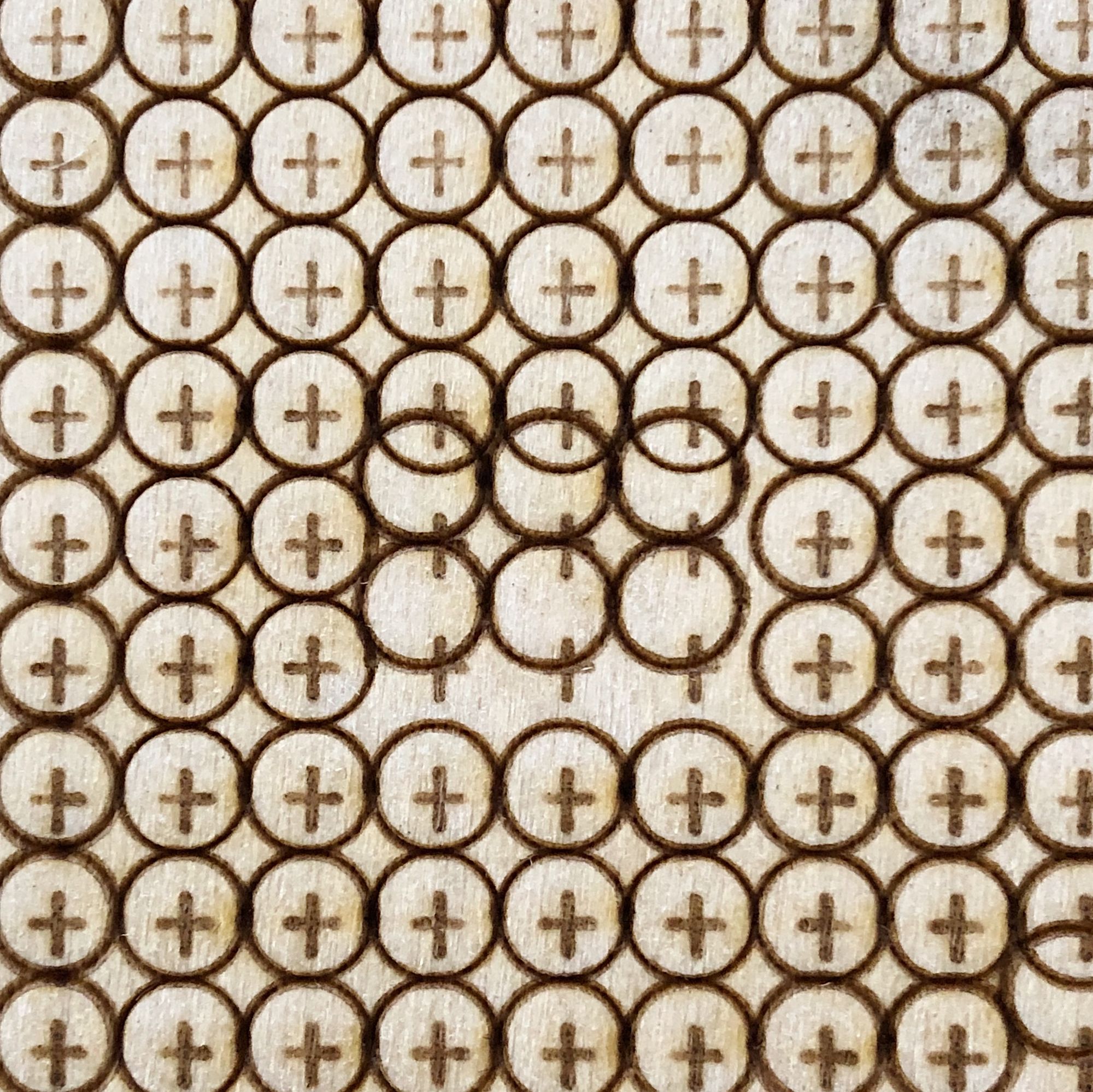
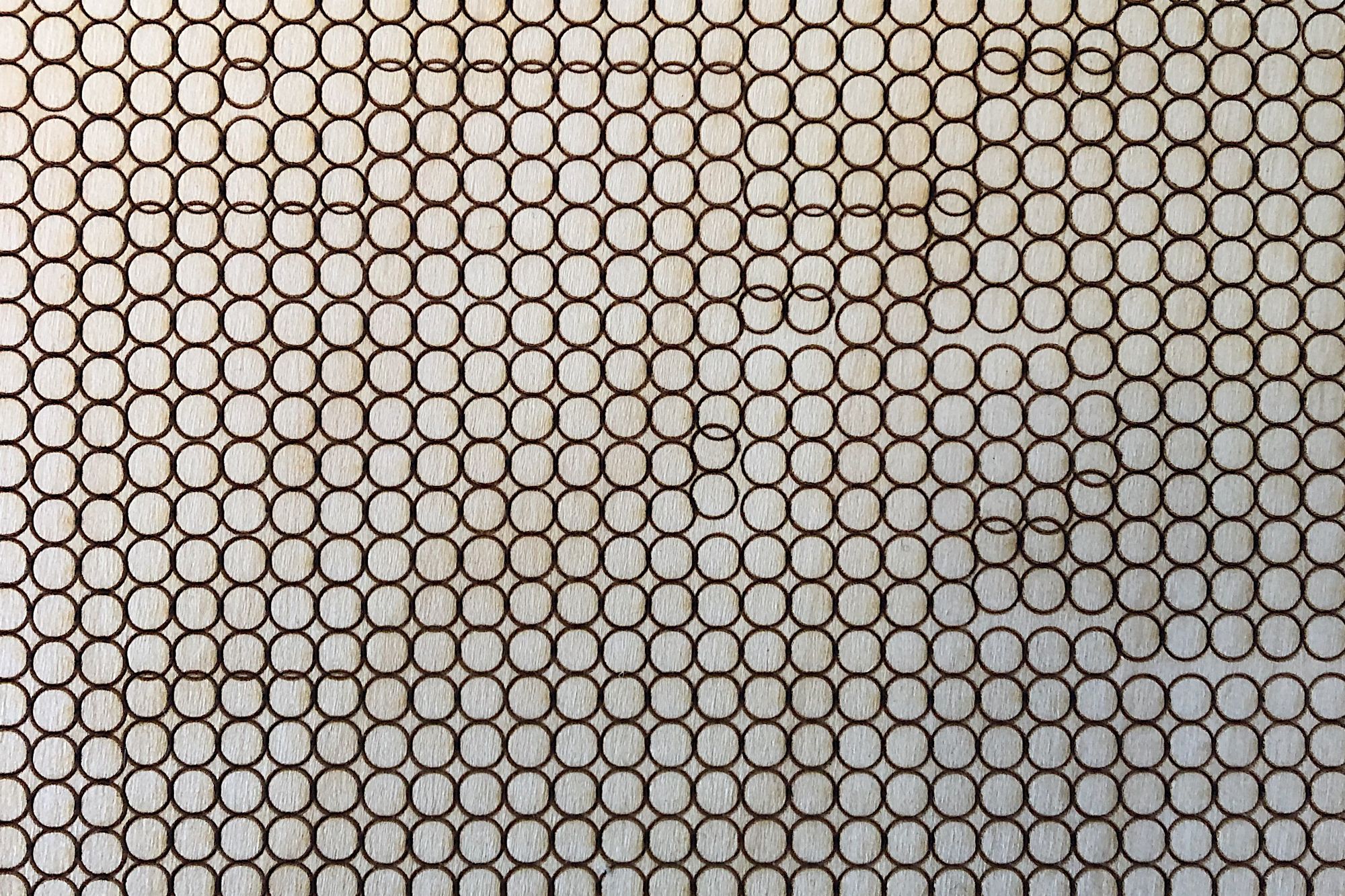
Several images showing early attempts (and failures) to achieve perfect grid alignment
This issue was incredibly annoying because every new test took roughly an hour to complete. After several weeks of trying to solve the problem, a co-worker gave me a simple recommendation: output the file as a single image instead of a pattern of hundreds of small circles. This new method for creating the image file worked, and the first several prototypes of Cartograph were born.
The fix in action: perfect, straight rows of weekly bubbles
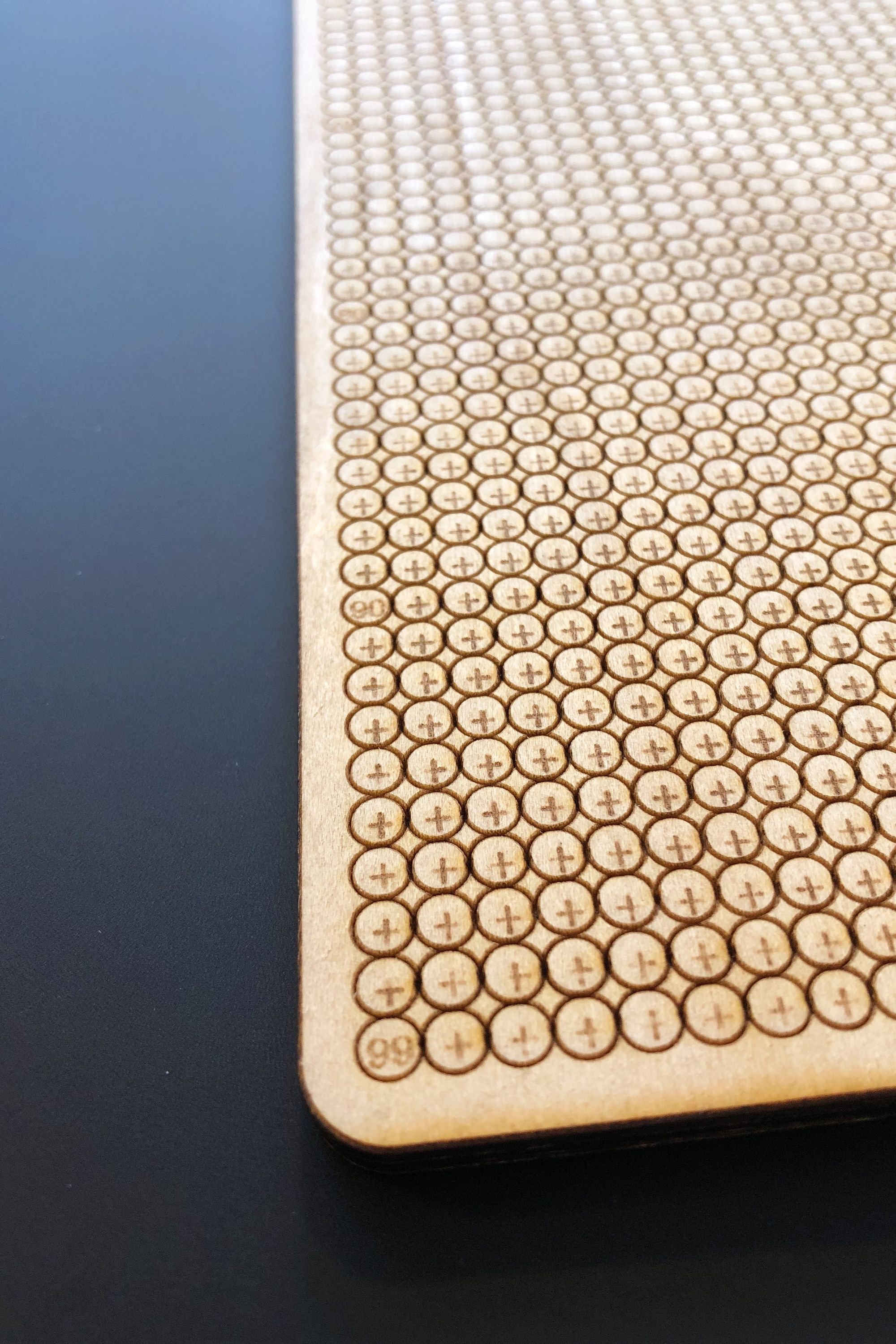
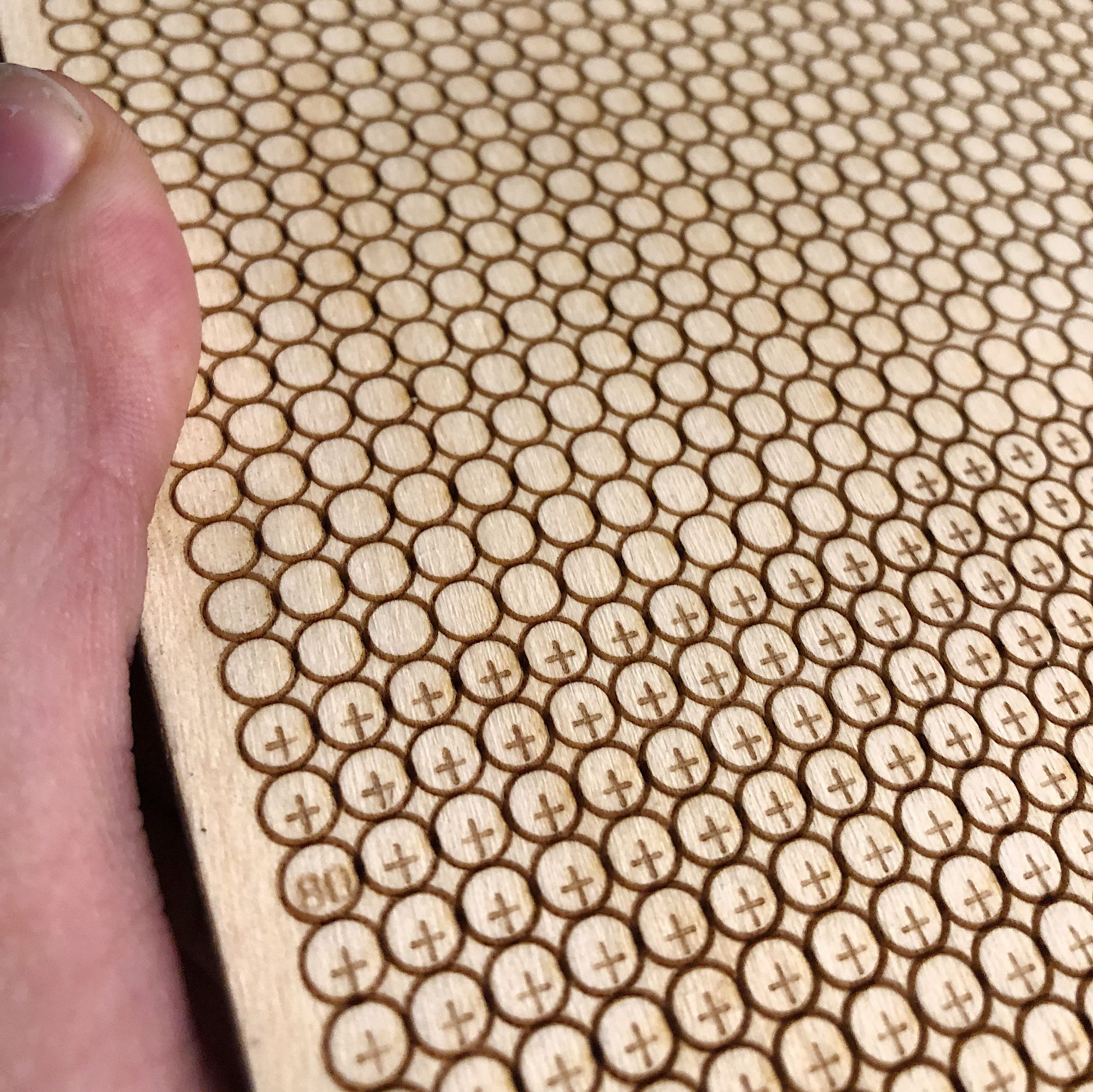
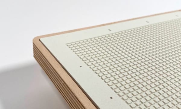
The initial version of the board was cut onto 1/8"-thick plywood and featured a 52 x 100 grid of circles for the weeks. After the 4020th bubble, I added a small "+" symbol to indicate weeks beyond the average life expectancy of an American adult (77.3 years). I also etched numbers for each decade directly into the board.
The first prototypes were promising, but I wanted something cleaner and more refined. My partner Al recommended I remove the plus symbols to simplify the board visually and remove the risk of moralizing longer lives. I also decided to switch to a thicker piece of plywood and replace the decade numbers with simple circular markers on the side of the grid. These changes got me closer to my intended design, and I gifted two versions of this prototype to my Mom and Al for the holidays. The images below are a version of the board I started filling in to get a sense of how it might look with a speckled pattern.
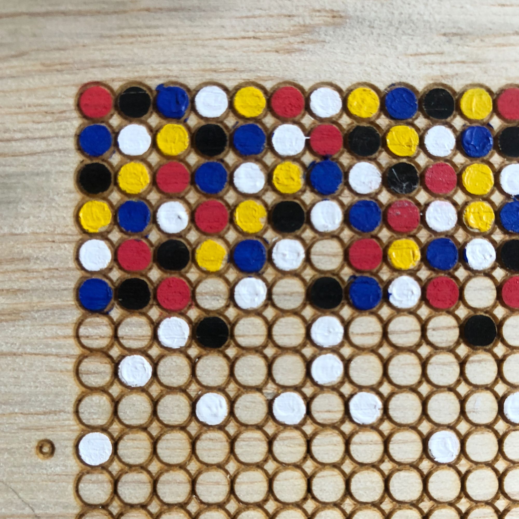
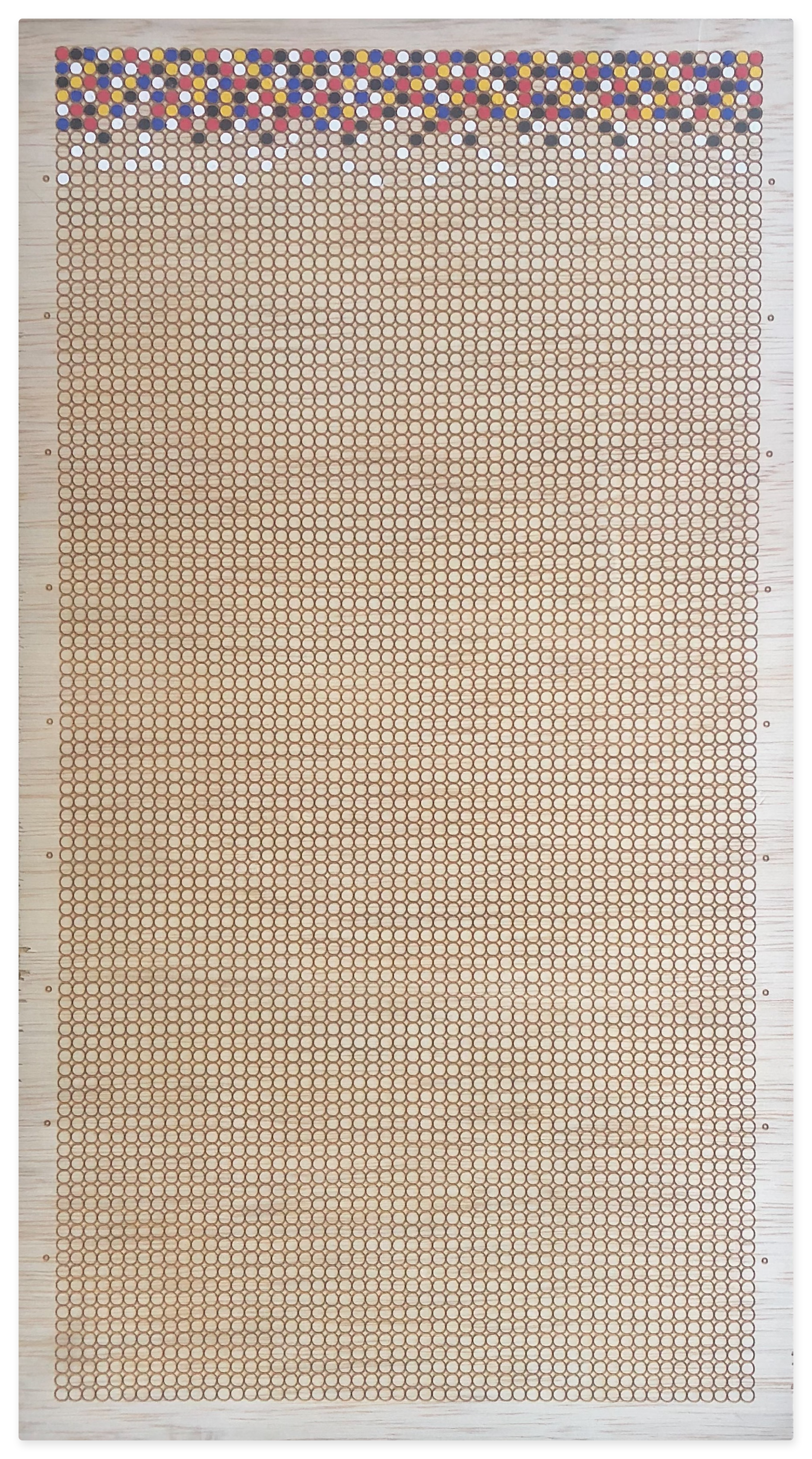
I was pretty happy with the first Cartographs, but several months after gifting them, I learned neither Al nor my mom had started using their board. The feedback I received was that getting started felt intimidating and that more guidance was required for using the board. This was straightforward enough, but I have a tendency to overcomplicate life. So, I also (erroneously) hypothesized that paint might not be the easiest/best method for filling it in.
Thus began the big detour for this project - a significant redesign and a second redesign - which ultimately revealed Cartograph's greatest treasures and illuminated my favorite method for using the board.
Closing Thoughts
Next week I'll share about Cartograph's major redesign (and redesign back!) and some initial thoughts on how I plan to fill in my board. If you've read this far, I really appreciate your support and interest in this project and would love to hear your ideas for how you might fill in your board.
With care, Max.
PS: Some of the links in this post are Amazon affiliate links. If may get a small kickback if you click them and decide to purchase.
